

In this article we examine the compelling advantages of co-ordination among poverty ‘fixers’ and the 3 simple changes they can make to achieve dramatic improvements in their combined impact on poverty reduction. These suggested improvements are set against the background of our approach to overcoming more poverty sooner with the same resources, by being smarter about it. Our overall 3 Step Plan to overcome poverty is: define it, map it and focus the poverty fixers. We illustrate the simple power of this Plan in this article, with a remarkable real-world success story. We recognise the 7 key fixers ‘globally’ as: the individual facing poverty themselves, their household, their community, their in-country government, NGOs, multilateral agencies and social entrepreneurs. We also advocate the 7 Layer Poverty Model as the unifying concept at the centre of our 3 Step Plan to solve poverty, rather like the hub of a wheel.

When you summarise a plan like ours to overcome poverty in a single paragraph, as we have done above, it can sound pretty simple. Then you do the Math. That’s when you realise co-ordination is ESSENTIAL if we are going to be smarter about overcoming poverty. To make the point, just consider the following. Imagine YOU are the one facing poverty and you decide to construct a table representing your situation, with the 7 Humanitarian Basic Layers of the Poverty Model down the left hand side: water, food, clothing, shelter, healthcare, engagement and freedom from oppression. Then, across the top of the table, you create columns for each of your 7 key fixers, including yourself. Immediately, you now have 49 places on the table to consider (ie 7 rows times 7 columns).
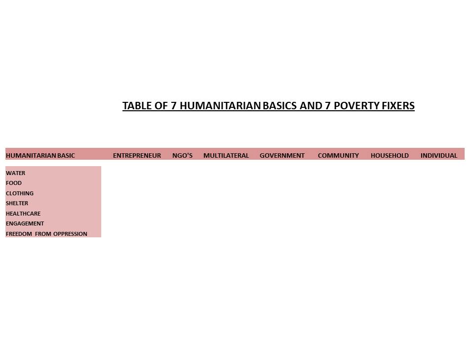
Plotting the above table out on a spreadsheet, we then decided to use shading in the cells of the sheet, to reflect the degree to which any one of the fixers might see overcoming poverty in each of the 7 areas as their responsibility – or “job”. Starting with the individual, represented by the far right hand column, we shaded all the cells in that column the darkest, to reflect that the individual sees it as very much their job to overcome their poverty in ALL 7 Humanitarian Basic areas. In the next column to the left, the household might typically perceive a shared sense of equal commitment to support the individual, up to and including the shelter layer. Beyond that, the household might recognise some lesser degree of responsibility for the individual’s healthcare (eg caring for household members when they are sick), engagement (supporting them at school, or finding employment) and freedom from oppression (providing basic personal protection).
There is no definitive or default level of shading which is appropriate for all situations, but we thought the diagram below might make you start to think about which fixer feels what level of responsibility for which area and for each individual. Lighter shading means a lower sense of responsibility. The actual original spreadsheets can be downloaded at the end of this article. Note that in the image of our spreadsheet below, we have special patterned cells for the NGO’s and the social entrepreneurs, as their influence can be dispersed and sporadic geographically, so they may or may not be a significant fixer factor in the experience of a given individual facing poverty.

If 49 cells wasn’t daunting enough for any individual seeking to overcome their own poverty, we then sought to highlight that in each of the 7 Humanitarian Basic Layers, the challenges faced by the individual may be many and various. Hence, in our next image below, we have introduced a few more rows, to reflect some of those extra considerations. For example, for shelter, we have included a line for land rights, another for sanitation and another for fuel – all of which are relevant. Similarly, for healthcare, there may be separate considerations and requirements for preventive healthcare, compared to remedial and emergency healthcare. There may be a need to engage with different government departments, and/or social entrepreneurs and/or NGOs for each item. Hence, in addition to the extra rows, you also have extra columns to consider. As you can see, it is not hard to imagine creating a realistic, representative sheet of over 100 cells! Remember, THIS range of engagement is the challenge we are expecting the individual facing poverty to overcome – before they have even started to persuade anyone to do anything to help. Could there be a better way?

At Give A Billion, we have developed our 3 Step Plan to overcome poverty, from simple internal logic and first principles. Imagine our delight when we found an organisation which has already put these 3 steps INTO PRACTICE – and with dramatic success. That group is called ‘Transparent Chennai’ (TC). As ever, you can Google them later with that search term to find out more. We recommend the Forbes article as a decent summary. In short, Chennai is an Indian city and TC decided to digitally map its half a million slum dwellers and some of their life conditions. Nithya Raman, who founded the project, says: “Maps can be very empowering…They offer a means for the urban poor to represent their case against the official record, which may underreport or completely ignore problems faced by communities in the city of Chennai or any other Indian city”.
Through a team of volunteers, TC mapped water supplies, communal toilets and sewerage facilities, identifying where they were, relative to the half a million slum dwellers – and which of those facilities were actually working. There is a significant political dimension to this. In India, if a slum is recognized, it receives basic services, which are then maintained and kept in good repair. Residents are also counted as part of the national population. Unrecognized slums get no help whatsoever and residents live in perpetual fear of eviction, meaning they see no point investing in their own homes and the area around them. In Chennai, no slum had been recognized since 1985. Hence, the poverty-mapping conducted by Raman and his volunteers identified BOTH the number of people involved and the precise nature of the challenges they faced.

The success was that the maps were shown to the government authorities who were responsible for the provision of the necessary services. They then took the maps and used them to persuade their own relevant internal departments responsible for each of the areas of need. TC is a project that took a lot of volunteers and they only had to target the information at one of the seven sets of fixers – namely the in-country governments. Consider the scale of the challenge involved if you were dealing with all 7 Humanitarian Basic Layers and seeking to engage all 7 sets of fixers together – and all on your own. Challenging, right?
That is where we plan to help. We believe that a number of lessons can be learned from the above and applied immediately, by anyone who sees themselves as a fixer. Each area has both an INTERNAL and an EXTERNAL facing component. You will see what we mean as you go through the list.
1. ORGANISE

Internally, this step is understood as ‘Co-ordination‘. Externally, it is understood as ‘Collaboration‘, meaning an organised form of working effectively with other interested parties .
INTERNAL CO-ORDINATION
One of the techniques used by the Transparent Chennai project was to show the resulting maps to members of the slum community, so they could better appreciate their own situation as genuinely interested parties. It is clearly far more persuasive to appear as the representative of half a million people, than a person speaking alone. Even if you occasionally have to speak about your case alone for practical reasons, make sure that you are speaking on behalf of the entire group. “Speak up for those who cannot speak for themselves, for the rights of all who are destitute” (Proverbs). We provide a simple spreadsheet tool to help small groups to begin to summarise and prioritise their own poverty-related challenges. This can be combined with the matrix above, to get an idea of which fixers are best placed to help address each problem. These things are not magical. They are practical. They help focus minds on what needs to be done and how. This is not to belittle the challenges that still remain AFTER the lists have been made, but a lack of co-ordination will not improve anyone’s chances – any more than a disorganised army will do better at war.
EXTERNAL COLLABORATION
With 7 Humanitarian Basics and 7 fixers, that gives 49 points of contact and consideration. In most cases, the number of external organisations and representatives involved in fully fixing poverty, even at the MICRO level, may run into hundreds. For a community-led initiative, there may be even more. This task cannot be left to one person. You need to form a ‘coalition of the willing’ among the fixers. Let each of them focus on the things that they find relatively ‘easy’ – the things that they are well set up to do. At Give A Billion, we are NOT set up to respond to requests for grant money. However, we are well set up to provide you with free tools to help focus fixers. They may be persuaded by the results you can show them from using those tools and may therefore be more inclined to help your particular group, or community. However, in order to know how best to collaborate with any given fixer, you need to understand HOW that fixer works and how best to engage with them. You need to ask for information before you ask for help.
2. MEASURE

Measure things that matter. We list the 7 Humanitarian Basics because we believe these are the things that matter most, for 7 billion people on the planet. You can tell how important they are by how much people suffer when they are missing. We seek to assess the relative impact on the individual, by considering life, health and other wellbeing factors. Again, these are the things we seek to measure as these are the things that seem to matter most to people.
MEASURING INTERNALLY: ‘KPI’S’
Once you are clear on the things that matter (‘key performance indicators’) and how you are going to measure them (‘monitoring and metrics’), you do not just measure ‘internal’ things once, but at least 3 times.You measure before, during and after any significant course of action.
-
Before, so you can measure your starting position.
-
During, so you can measure progress.
-
After so you can measure impact.
When it comes to representing larger groups of people, personal stories can only go so far. How often will you get the chance to describe 100 people’s stories in person and in detail? Maybe never. You have to convert qualitative stories into quantitative data. Once you have the data, then you have to think about how best to PRESENT it. Maps are consistently compelling, as the Transparent Chennai project showed clearly. They can present lots of data in a format people can easily absorb. We need the measurement data to be presented in a format that most people can understand. Maps are good for that.
MEASURING EXTERNALLY: ‘BENCHMARKING’

Comparing your own performance reasonably against that of your ‘peers’, is often referred to as “benchmarking”. Once you have your OWN sets of results and measurements, you can compare and contrast them with others. That is why you measure before, during and after your various internal actions. By doing so, at the very least, you can compare your own progress against your own starting position and observe what has changed and by how much, over how long. However, you will ideally want to have other situations which you can compare your own results to – and they may want to do the same with you. If you are conducting a Simple Assessment for your own community, you may want to compare your results with a Simple Assessment from a similar community to your own. Or perhaps you may conduct both Assessments yourself and compare the results.
The great advantage of comparison, is that others may see that your experiences are not so different from their own. They may be encouraged to use adopt your example, as a motivation to proceed themselves. The Transparent Chennai project has been used as an example of what other Indian cities could do, as well as other communities beyond India. Once you have your own data, you can also ask other data holders to compare other situations with your own. You may find that the officials you approach are surprised by your own data, as they were unaware of it. It is hard to imagine that half a million people could be overlooked by Indian authorities, but it apparently happened in the case of Chennai.
3. PRIORITISE

ORDERING PRIORITIES INTERNALLY
Our simple tool and suggested method can help here. If you can’t use the tool, you can still use the principles. Identify priorities between any long list of tasks, by giving each one a score against 3 criteria: importance, urgency and ease. we suggest making the top score in each category a 1, the middle-level items 2 and the lower level items a 3. Then multiplying them together means the lowest scores are your highest group priorities. From the longer list capturing ALL your collective issues, the shorter list again helps focus group attention on the things you have collectively agreed matter most to you as a group.
ORDERING PRIORITIES EXTERNALLY
Ease is typically measured by relative assessments of potential COST, in terms of time, money, hassle, risk, efforts, energies, attention and other resources. Cost is perceived differently by different people or groups, in each situation. Hence, for the financially wealthy, time may be more precious than money. Therefore, they may be more inclined to consider an expensive solution “easy”, if it can be done using a credit card, quickly, with minimum hassle. To a person skilled with spreadsheet manipulation, using our tools may seem “easy”. For someone who is technically illiterate, the same task would be impossibly hard. Getting a co-ordinated team together means that you can start sharing out tasks between the people, or organisations who are best-placed to do them – those for whom such allocated tasks are relatively ‘easy’. You cannot do everything at once, so accept that you will do “first things first” – and other organisations you are working with, will have to do the same.
The following are links to the tools you may find useful, or articles that can guide you further:
- Macro Level Decision-Making Tool
- Micro-Level Prioritisation
- ‘Whose Job’ Fixers Matrix – Simple Example
- ‘Whose Job’ Fixers Matrix – Expanded Example
If you count yourself as one of the fixers planning to overcome poverty, or can pass on these free tools to someone else who is, then we thank you for being… One in a Billion